ESCI 407/507: Forest Ecology
Spring 2024, Lab #1: Data in Cyberspace
and Introduction to Excel
This page last updated: 4/2/2024
Objectives: The objectives for this lab are to provide a brief introduction to the process of searching for and downloading data from the Internet and to the use of Microsoft Excel for use in data processing, simple statistical analysis and graphing. These are skills that we will be using throughout the remainder of this course. These are also skills that will be valuable in your other courses and in the job market as well. Some of you may already have a great deal of experience with computers but my guess is that many of you have very little experience beyond the use of word processors. This lab will only get you started. Other sources of information include the Student Technology Center in Haggard Hall Room 212, classmates and that nice computer geek who lives down the hall from you. Note that the Student Technology Center also has lots of online resources so you might want to check out their website (Click here for the Student Technology Center website).
Required Resources: Someplace to store some data: this could be your U:
drive AND a USB Jumpdrive. Be sure to store your
data in at least two places! “The computer ate my data” is not a valid
excuse for turning in your lab report late!
Here is what I want to do today:
1.) Run a web browser (Netscape or Internet
Explorer or Mozilla Firefox): Search the Internet for climate data for
2.) Snip out the subset of data we need and import it into an Excel Workbook.
3.) Manipulate these data using simple spreadsheet functions and produce some
simple graphics.
I. The Web: Unless you have been hiding under a rock somewhere for the past decade or so, you already know that there is an amazing amount of information that is currently available on the Internet. You need to know how to find the information you want. You can waste huge amounts of time surfing the net. You need to use your time effectively to find what you need.
A. Start a web browser (NETSCAPE, Internet Explorer, Mozilla Firefox or something similar): In virtually any university computer lab, you should see an Internet Explorer icon on the screen. Double click on the icon to start Internet Explorer. Depending on how the machine is set up, you may instantly be sent to the WWU home page. If you have never explored this page, you should. Among other things, you can locate email and phone numbers for faculty, staff and students and you can also access the library's online catalogue.
B. Web Page addresses: You probably already know this but……near the top of the screen, you will see a "Location" box that contains the Address for the web page you are now viewing. If your machine is set up to start you at the WWU Home Page, the address is:
http://www.wwu.edu/
The "http://www" part is the prefix for nearly all web pages (the "www" part means, "world wide web"). Web page addresses for universities are fairly predictable. For example:
http://www.osu.edu/ (
http://www.orst.edu/ (
Those of you who are thinking about graduate school ought to be thinking that this might be a really good way to find about more about different programs. It is!
Web page addresses for federal agencies are also fairly predictable. For example:
http://www.nsf.gov/ (National Science Foundation)
http://www.epa.gov/ (Environmental Protection Agency)
http://www.usda.gov/ (US Dept. Of Agriculture)
http://www.nasa.gov/ (NASA)
http://www.noaa.gov/ (National Oceanic and Atmospheric Administration)
C. Searching the Net: There are lots of search engines available that allow you to find information on the web. Google is one of the most widely used. You can get to the Google home page in lots of different ways. In the location box, simply enter the address: “http://www.google.com” or simply “google.com”. Alternatively, there may be a button on your toolbar (just below the Location box) that will take you to the same place. In the search box on the Google website, enter "climate data" and hit the "Search" button. You will pop to a different window with a list of links to websites that contain climate data. At the top of the page, you will see a message that looks something like:
About
49,300,000 results (0.33 seconds)
This means that the search engine found over 49,000,000 web pages with something about climate data. For your lab report you will need to carefully read each of these 49,000,000 pages and summarize them.................. or maybe not. A bit farther down the page, it provides a bit of information about the first 10 of these 49,000,000 pages.
Notice that for each of these ten entries, the title for the web site is highlighted in blue. Also note that when you move the pointer over one of these labels, it changes from a pointer (arrow) to a sort of cartoon hand with the index finger out. These blue labels are "hot links" to another web site. If you point to the label and click with the left mouse button, you magically switch to this new web page. If you want to go back to the previous page, hit the back button on the upper left of the screen. Explore some of these pages.
D. Long-term Climate Data: Next week, we
will be doing a lab exercise that requires data on year to year variability in
temperature and precipitation for western Washington. We don't want mean values
(i.e., mean January temperature etc.), we want information on year to year
variability. In the past, I have used
data from something called the
http://lwf.ncdc.noaa.gov/oa/climate/climatedata.html
This year, I want to use data from a different source. Go to this website:
PRISM Website: http://prism.nacse.org/
PRISM is a model that interpolates data from existing meteorological stations. This interpolation process is particularly challenging in mountainous terrain. When you go to the PRISM website, it should bring up a page that looks like this

Click on the Data Explorer link near the bottom of
the page. This will bring up this:

Using this tool we
will download monthly data for ALL SEVEN of the available climate variables;
precipitation, minimum temperature, mean temperature, maximum temperature mean dewpoint temp, min
VPD and max VPD.
Start by entering the coordinates for our study area: longitude -121.68 degrees, latitude 48.86 degrees. The hit the Zoom to location button. Under Data Settings select Single Monthly values starting with of January 1895 and an end 2024. Select SI units. For Climate Variable start with precipitation (we will repeat this for the other variables in a moment). Then, under Controls hit the Retrieve Time Series button, then the Download Time Series button. Save this file and then open it in Excel.
Our goal here is create datasets for precipitation, minimum temperature, mean temperature and maximum temperature that are formatted like this:
|
Jan |
Feb |
Mar |
……. |
Dec |
|
|
1895 |
|||||
|
1896 |
|||||
|
. |
|||||
|
. |
|||||
|
. |
|||||
|
2024 |
To do this, we need to download the data for each climate variable one month at a time, then manually add one column of data after another to create a table formatted in this way. I realize that this is a bit of a pain and rather repetitive. I’d encourage you to divide the work among several classmates to get this done. You will need to query PRISM for each month one at a time. Note that one of the options is to run it for “ALL” months but this will yield a dataset that is not properly formatted.
Create a similarly formatted spreadsheet for minimum temperature, another for mean temperature and another for maximum temperature.
II. Excel: We will be using Excel quite a bit this quarter. Some of you are very familiar with Excel and others aren’t. Our lab exercise for today is intended to help everyone get up to speed
A. Calculating Annual Summary Data: I want to get us all up to the same level so I will provide detailed instructions on the use of Excel during. Those of you who are very comfortable with Excel can simply skip this and go to the end where I list the summary graphics that I want to see.
B. Formulas: One of the most powerful features of spreadsheets is their ability to deal with formulas. To illustrate, let's calculate annual precipitation. In my case, my first year (1895) is on line 12 and the January data starts in column B. So, go to N12; this should be adjacent to the cell with the December, 1895 precipitation entry. In cell N12, enter "=sum(b12:m12)". After hitting the return, you should get an answer of 1602.65. This value is in millimeters. (If you mis-typed, you can edit your entry by hitting the F2 key and moving the cursor to correct your formula.) This is the sum of cells b12 through m12. Pretty cool isn't it?
OK, now let's copy this formula to the rest of the column. Click on N12 and hit the copy button. Then click (left mouse) and hold on N13 and drag to N140. (NOTE that we do not yet have the PPT data for March-December of 2024 so it doesn’t make sense to calculate total annual PPT for this year). Then click on paste. Your formula is now magically copied to all the entries in the table. In cells N10 and N11, it might be wise to enter a column label; something like “Total Annual PPT” might be useful.
Mean annual precipitation: Now that we have annual precipitation for each year from 1895 to the present, let's calculate mean annual precipitation for the entire record. Go to N142 and enter "=average(N12:N140)". After entering the formula, we see that, between 1895 through 2024, in our study area, the mean annual precipitation has been about 2074.625 mm or about 2 meters. If you didn't get something very close to this number, then either you or I have goofed.
Water Year Precipitation: As most of you know, it only rains once a year here in the PNW; it starts raining in October and it stops raining in June…..or so it seems. The implications of this is that calendar year precipitation (January 1 through December 31) is really less meaningful than the total rainfall during a given rainy season (October 1 of a given calendar year through September 30 of the following calendar). This is what is referred to as the “water year.” You just calculated the calendar year precipitation by taking the sum of the monthly precipitation for a calendar year. For the water year precipitation, take the sum of Oct-Dec for the previous year and the sum of the Jan-Sept precipitation for the current year. For the year 1896, in cell O13, enter “=sum(k12:m12,b13:j13)”. This should take the sum of the monthly precipitation values for Oct-Dec 1895 plus the values for Jan-Sept 1896. This covers the 1896 water year. Note that you can’t calculate the 1895 water year since we don’t have the values for Oct-Dec of 1984. In cells O10 and O11, it might be useful to enter a column label; something like “Total Water Yr PPT” might be useful.
Dynamic Updating: Part of the power of spreadsheets and the use of formulas for cell entries is that the formulas will update your entire table if some of your data change. Go back to B12. You should have a value of 248.62. Just for fun, enter a value of =10000. If you go to N12, you see that the annual ppt has changed to 11354.03. The spreadsheet recalculated the formula when you changed the cell entry. Now go to N142 and you will see that the value has changed to about 2154.555. Imagine if you had to do these recalculations by hand!
OK, NOW GO BACK AND CORRECT THE ENTRY FOR
B12!!!!!!!
B12 SHOULD BE
248.62!!!!!!!!!!!!!!!!!!!!!!!!!!!!!!
C. Graphics: (needs updating for Office 2007) Now let's produce a simple graphic. Go to Insert-Chart-Scatter. Select a chart subtype that connects the points with lines. This will bring up a blank window that is plunked down on top of your data. You can grab this window and move it to the side so that your data are not obscured. Your next choice it to specify the data you want to plot. To do this, move your cursor to somewhere inside the blank chart window. Then Right-click and go to Select Data. This brings up the Select Data Source window.

Click on ![]() to bring up the Edit Series window.
to bring up the Edit Series window.
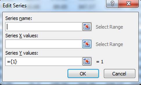
If you know the addresses of everything, you can
type in the information, but I prefer to point at the data I am interested in.
To do this, go to the Series Name box and click on the red arrow ![]() on the right side of this box. Then move this
Edit Series window out of the way and move to N10, left click and hold and move
to cell N11 (assuming that you put a column label in these cells), then let go
of the left mouse button and hit return.
The address of these cells will now appear in the Series Name box. For the “Series X Values, click on the red
arrow button
on the right side of this box. Then move this
Edit Series window out of the way and move to N10, left click and hold and move
to cell N11 (assuming that you put a column label in these cells), then let go
of the left mouse button and hit return.
The address of these cells will now appear in the Series Name box. For the “Series X Values, click on the red
arrow button ![]() to the right of this box, go to A12, click and hold and move to A141. Let go of the left mouse button and hit
return. The cell address for the Years
should now appear in the Series X values box.
Finally, for the Series Y values box, click on the red arrow
to the right of this box, go to A12, click and hold and move to A141. Let go of the left mouse button and hit
return. The cell address for the Years
should now appear in the Series X values box.
Finally, for the Series Y values box, click on the red arrow ![]() to the right of this move to N12, push and
hold the left mouse button and move to N141. Let
go of the left mouse button and hit return.
The cell addresses for the Total Annual PPT values should now appear in
the Series Y values box. Now click OK in
the Edit Series widow. Now click OK in
the Select Data Source window. Back in
your graphics window, you should now have a nice plot of the Total Annual PPT
from 1895-2024.
It will look something like this.
to the right of this move to N12, push and
hold the left mouse button and move to N141. Let
go of the left mouse button and hit return.
The cell addresses for the Total Annual PPT values should now appear in
the Series Y values box. Now click OK in
the Edit Series widow. Now click OK in
the Select Data Source window. Back in
your graphics window, you should now have a nice plot of the Total Annual PPT
from 1895-2024.
It will look something like this.

You can now fiddle around with the chart to add some appropriate axis labels and perhaps change the maximum and minimum values on both axis so that your data fills up the graph a bit more. For example, it might be more appropriate to have the Y-axis begin at 1000 and end at 3500 and maybe the X-axis could go from 1890-2020. There is lots that you can do to pretty the graph up a bit if you want.
You now have the very basic basics of Excel. There is much more to it but this should give you enough to get started. We will be using this alot this term. Take some time to play with it and get your friends to show you their favorite tricks. For anything you want to do in Excel, there are probably two or three different ways to do it. There may be much easier and better ways to do the things I have described above.
D.
Mean Monthly Temperature: You will download the data for Precipitation and Minimum and Maximum
Monthly Temperature. We also want Mean
monthly temperature. This can be
calculated from the Maximum Monthly Temperature. For each Month/Year, the Mean monthly
temperature is simply the mean (average) of the Minimum and Maximum temperature
for that month. The easiest way to do
this is to have a separate worksheets for precipitation, minimum temperature
and maximum temperature. Then create a
fourth worksheet with the same layout (Years for row labels and months for
column labels). Then calculate the mean
monthly temperature for each cell by using pointers to the minimum and maximum
temperature pages. In my case, I have
labeled the worksheet tabs for each page (e.g. the minimum temperature page is
labeled “mintemp”, the maximum temperature page is labeled “maxtemp”). On both of these pages, the 1895 January
temperatures are in cell B12. So, on my
mean temperature page, cell B12, I enter this function:
=average(mintemp!B12,maxtemp!B12). I
then copy this function to all other cells in the table. You don’t need to do
this calculation since you downloaded Mean Monthly Temp
III. Homework: We will be using these data sets in an upcoming lab so it is critically important that you've done all of this correctly. Save the disk with these three data sets. As a way of confirming that you have done all of this correctly, I would like you to give me the following.
A. Graph of total annual precipitation on Y-axis, Year on the X-axis for 1895-2024
B. Graph of total “Water Year” precipitation on the Y-axis, Year on the X-axis for 1896-2024. (Both A. and B. can be on the same figure)
C. Graph of mean annual temperature on Y-axis, Year on the X-axis for 1895-2024. The mean annual temperature is calculated from the mean monthly temperature.
D. A table containing all the data used to produce these figures.
E. A summary of the contents of the 49,000,000 web pages.............no not really!
Return to ESCI 407/507 Lab Index Page
Return to ESCI 407/507 Syllabus
Return to David Wallin's Home Page